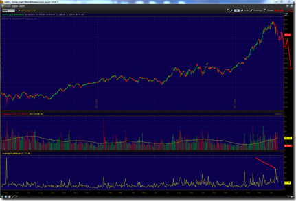
Do you think AAPL’s bubble has popped? I think so and here’s why: the biggest one-day rallies in a stock normally happen in a bear market as short covering rallies draw in lots of followers who believe that the stock is back on it’s path to new highs. Well, last week we had the biggest one day gain ever, much larger than any normal day and larger than the gap up after Q1-2012 earnings! This tells me that the market has peaked at 644 and we’re on our way to a downtrend!
4/23/2012
3/27/2012
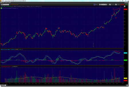
Final thrust?
AAPL appears to be tracing out a final ending diagonal to end it’s rally from $580. Look for a very sharp decline in the next week, leading to a test of at least $570 in the next couple weeks.
3/14/2012
And the bullish drum beat continues…
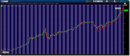
AAPL has truly gone parabolic in the past few days. If the stock touches $590-$600 today, I would be willing to predict that its run ends this week, and subsequently AAPL starts a 2-4 year downtrend. I predicted a similar outcome with NEP in the face of massive criticism. The pattern on AAPL is almost identical, so I am as confident now as I was back then.
2/28/2012
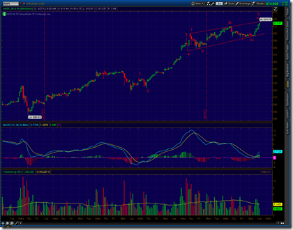
Divergence Forming on AAPL… Buyers beware
I posted a cautionary article about AAPL a few weeks ago, but it continues its massive rally. Take a look at the chart below, and then throw caution to the winds. Its 5-wave small-time-frame rally appears just about finished, and there is ominous MACD divergence.
2/09/2012
Dare to short AAPL?
These days, you’d be crazy to even think about shorting AAPL, right? They just had killer earnings and are on track to earn $40+/share in 2012, giving them a nice, comfortable valuation. However, the charts point to the notion that a long-term top is right around the corner.
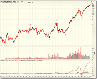
First, on the monthly chart above, note that AAPL appears ripe to complete a 5-wave rally that started in 1998! I would expect a multi-year correction to ensue soon based on this chart alone.
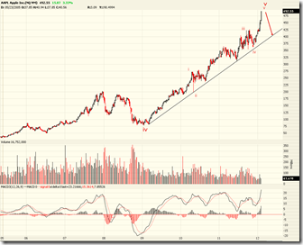
On the weekly chart, you can see that Wave-V from the first chart has subdivided nicely into 5-waves as well. Even on this shorter timeframe, the wave pattern indicates that upside is limited.
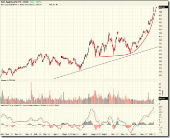
The daily chart shows a typical parabolic blow off to finish Wave-V. Importantly, recent price action is confirming that a top is very near:
During a climax top, a stock leader that has risen for many months will suddenly take off and run up much faster than it has in any week since the start of its original move. On a weekly chart, the spread from the absolute low to the absolute high of the week in almost all examples will be wider than any price spread in any week so far.
- William O’Neil in The Successful Investor, pg. 80
This weekly candle is on track for being the largest weekly gain in dollar terms, ever. Furthermore, we’ve seen 5 straight days of gains, with today’s price action including a large gap up followed by a large rally. This is typical blow off action, and it implies that the market is becoming too one-sided to sustain further long-term price rises. Look for a multi-month or multi-year correction to start soon.
